Project 4 – Perspective

Exercise 1 – Parallel Perspective, an interior view.

Drawing from one room to another was enjoyable and reminded me of paintings that had caught my attention in the past. Harold Gilman, Edouard Vuillard and Jack Smith come to mind. Here are three paintings I remember:

Mrs Mounter (1916-17) by Harold Gilman


Mrs Mounter Harold Gilman


The Vestibule of Saint Jacut de la mer (1909) Eduard Vuillard.

the-vestibule-at-saint-jacut-de-la-mer.jpg!Blog


(c) Jack Smith; Supplied by The Public Catalogue Foundation
(c) Jack Smith- (1952) After the Meal.

Perspective obviously plays a part in all three of these pictures , leading one’s eye from one interior into the next.

For this exercise I chose a view from the kitchen into the living room .The kitchen lino was marked into squares. These  and the lines of the door, helped me to roughly establish a perspectival space.  Having finished the drawing I found marking in the eye level helpful. This showed me that some of my angles were wrong and I was able to adjust them.  Using a ruler helped.

Parallet perspective drawing


Project 3 -Composition.

Reflections on exercises 1 and 2.

a) How did you simplify and select?

Shape and size were important as were straight and curved lines. I looked for contrasts in shape , in tones and in  weights of line. Texture was also something to be aware of but needed to be limited.

b) How did you create a sense of distance and form?

Distance was created by reducing the size and also creating a more blurry, blue effect in the background.  I found foreground figures a good way of showing distance with figures getting smaller and smaller as they got further away.

c) Were you able to use light and shade successfully?

Colour and tone was much sharper in the foreground and this created a chance to define more detail. What was interesting in the sketchbook walk was the fading light so that the lights of the windows in the distant buildings became more and more defined.

d) What additional preliminary work would have been helpful towards the larger study?

Perhaps some studies in other media – pencil and charcoal.  Also making the drawing bigger could have thrown up more ideas. Experimenting with different shapes on the hillside of my sketchbook walk drawing could have been useful – I did wonder about putting in a dog or rabbit.

Overall though I found the quick sketches suggested potential for further work . However they all had an immediacy which was difficult to repeat when faced with improving them.


Project 3 Composition

Developing your studies.

Looking back on my 8 rapid sketches  I thought about distance and close-ups , what was essential (the bones of the landscape) what could be taken away and what added. Focal point also had to be taken into account. I decided to work on sketch 3 from my sketchbook walk as I felt the sweep of the land and the path, the triangular roof in the distance and the way the figures became larger and larger as they approached me met the criteria of developing this study.  I am also interested in working on Sketch 2 from the 360 degrees exercise as the composition suggested some potential.

Drawing 2 from 360 degree exercise360 degrees - Drawing 2

_________________________________________________________

Drawing 3 from my Sketchbook Walk


Sketchbook walk third drawing

Exercise 2 Composition – Foreground, middle ground and background.

My first attempt using mixed media (coloured pencil, conte and charcoal )made the background recede more, brought in a middle ground by the placement of a tree and emphasised the foreground with the enlarging of the figure and placing of the head of another figure showing the movement down the path. Other figures, as in the original, got smaller the further up the path.  However I preferred the original sketch because there was more of an immediacy about it. Somehow it expressed spontaneity whereas the second attempt looked more laboured.  So then I tried with dip pen, brush and sepia ink. The recession worked well with this and the texture of the land added interest,  but I still felt dissatisfied.  I will have to come back to these drawings to assess them more clearly.

1.Mixed media drawing.                  2. Dip pen, brush and sepia ink drawing.

Foreground, middleground, background

Research Point.

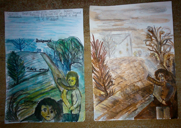
Comparisons of the approaches of contemporary artists working with landscape  with earlier  artists.

TacitaDean fatigues Tacita Dean (2012) Blackboard Drawings (Installation) Fatigues.

Seurat black and white drawing 
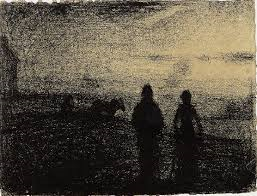
Georges Seurat, (1882-83) The Ploughing.

There are both similarities and differences between these two art works. First Tacita Dean uses black and white like Seurat to create both drama and mystery.  However Dean’s  Fatigues  is huge compared with the size of Seurat’s drawing. Nevertheless the shapes, inspite of the difference in scale, both have a  shimmering effect. Both artists define their forms through tone and outline. Line does not predominate. Also in both works abstraction is evident even though landscape is suggested.  Dean’s Fatigues reminds me of clouds or weird ‘masses’ floating across the sky, the images give the impression of movement, as though they are caught floating in the air. In contrast Seurat’s image is all stillness .The mystery of both images leaves open their interpretation to the viewer in a way that a more figurative piece would not.

______________________________________________________


carel-weight-

Carel Weight – (1962) Daisy in the garden.


.samuel palmer Samuel Palmer, (1825) The Valley Thick with Corn.

Both artists, create a unique sense of place. In Palmers’ pen and ink, monochromatic, picture, the bountifulness of Nature is depicted through the ripening corn, the animals, trees, everything is coming to fruition. Man, or maybe a labourer, is seen as central to Nature and is placed in the middle and bottom of the composition. It is a  romantic vision. Carel Weight depicts a suburban setting in which a single woman is depicted . There is a slight feeling of threat in the setting suggested by the  trees , ramshackle fence and angle of the buildings – it is the composition that , above all, creates this feeling of unease – maybe the figure is lonely – the picture certainly suggests a narrative.  Importantly sentimentality is absent from these expressive works.


__________________________________________________________


. landscape by colquhounRobert Colquhoun (1914-1942)

1942, Church Lench.

Van Gogh’s La Crau from Montmajour (1888).

Van gogh La Crau from Montmajour

Colquhoun’s  landscape is  close up, the packed composition conveys the feeling of a riot of trees and foliage emerging from undulating land.  Like the Palmer (above) it conveys the fecundity of Nature.  Colours are  fairly monochromatic apart from the  blue in the sky. In contrast Van Gogh’s landscape depicts vast distance with the marks getting smaller and smaller.  This is done with a pen using a variety of spots, flecks, lines and so on. So three -dimensional space in the Colquhoun is conveyed mainly by shape and colour and in the Van Gogh by different sized marks.  Both the shapes in  Church Lench and the marks in La Crau from Montmajour create movement.


Ex. 3: 360 degrees studies.

Like the last exercise this required fast drawing and concentration.

Each view was a discovery. The first sketch, with the view of the cathedral in the distance, suggested a ‘traditional’ scene of Canterbury.   Drawing 2 , in which the road seemed initially boring, turned out to be the opposite – the curves and differences between foreground, middle ground and background created a flowing composition that met at a focal point. The third drawing  had contrasts of dark heavy trees around the building that contrasted with the lighter, more airy silver birch at the side.  In the final sketch the winding ,orange fragile net which had fallen over in the field made  a dramatic contrast with the dark, straight background of distant trees.360 degrees - Drawing 1

360 degrees - Drawing 2

Drawing 3 - 360 degrees

Last drawing 360 degrees

Research- John Virtue

Picture 643
Picture 643

John Virtue- Landscape No.67.

I saw this arresting piece some time ago on display at the V & A and thought it was a print. From a distance it looks abstract but close to it is a series of landscape drawings.

In fact it is a series of sketches made on the spot on walks near Virtue’s home in South Devon where he lived between 1988 to 2004. The sketches were worked up heavily with pen and ink restricting the palette to black and white. The drawings were then incorporated into a larger, composite picture.

Thus the viewer is given different renditions of the landscape at different times and at different places so gets a repeated  experience of being ‘in the landscape’.

This seems a wonderful example of what can be created from sketchbook walks.

Bibliography:  Owens, Susan, (2013) The Art of Drawing, V & A Publishing.

Ex. 2: Sketchbook Walk

This was an enjoyable but demanding exercise. I took a familiar route and stopping to draw helped me see things that I’d hitherto ignored. As directed I tried to put everything I could see into the sketches.

I set off at 3.15pm on a damp, dark day- grey skies and the light already failing. In sketch 1 there was a definite division of foreground, middle ground and background. Trees made a dark textured pattern and became lighter in the distance. The main interest was the winding path.Sketchbook walk - first drawing

Half way up this path was a dark glade to the side of it. The focus was a bunch of leaning trees and behind them was a wilderness of branches. Little patches of light were to each side of the dark mass of trees.Sketchbook walk second drawing

Sketch 3 was done towards the top of the path with the focus on the building and its unusual triangular roof- the light was rapidly failing showing up the warm lights in the windows. The figures coming down the path got rapidly bigger as they approached me- find this fascinating to experience.

Sketchbook walk third drawing

Sketch 4. Darkness was descending. I moved to the side of the path where there was a seat and drew the view of the building from this position which meant looking sideways up the grassy field.  There was a tall thin tree in the foreground and a much larger and darker tree in the middle ground.The particular slope of the ground I found difficult to depict from this angle. Light from the windows in the distance could be clearly seen. By the time I had finished it was completely dark showing up the figures going down the path as dark shapes.Sketchbook walk fourth and final drawing

This exercise was challenging . Each drawing was done rapidly and showed me that there was a lot of potential in this one path. Later in the day I worked on each drawing a little more.

Ex: 1 -Cloud formations and tone

Constable cloud study
Constable cloud study.


I experimented with different media, charcoal, watercolour and dry pastel .  The light was constantly changing in the sky and pink appeared at one time which I tried to capture. First attempt more like the sea, second and third attempt captured something of the movement and dissolving quality of the clouds.Exercise 1 cloud formations and tone2nd and 3rd attempt at cloud formations

Then looked at Constable and cloud studies at the V & A and found a book on Vija Celmins. Constable’s studies look surprisingly modern showing the brushstrokes which capture the movement of scudding clouds in the most brilliant way. Celmins work also draws attention to the media -difficult to see in reproduction.

Vija Celmins, born in Riga, capital of Latvia in 1938. Second world war an important factor in her work on toy aeroplanes -made in the mid 1960s.

Celmins- ‘Sometimes I think the meaning is only in the material.’

Later work on starry night skies. Celmins’ Even though you may think they came from lying under the stars, for me, they came out of loving the blackness of the pencil. It’s almost as if I was exploring the blackness of the pencil along with the image that went with it’.

Celmins’ toy war aeroplanes remind me of Colin Self’s  work on a similar subject. Colin Self (b.1941) – great draughtsmanship and some of the work overtly political.

6th Monument by Colin Self
Monument- etching by Colin Self.


Storm -clouds -Constable, 1816.jpg
Constable, John, 1816,Storm Clouds.


Vija Celmins 'Untitled ' clouds - pastel painting
Vija  Celmins (1975) ‘Untitled’ – Clouds , pastel painting.

Reference: Celmins, Vija, (2004) Lane Relyea ,Robert Gober and  Briony Fer, Phaidon.

Project 2 Landscape

George shaw treeGeorge Shaw The Appointment.

Tree nearly in centre of composition and dominates the picture.  Lots of movement in the surrounding field.

Sarah Woodfine also interesting with her surreal constructions.


Artists who use landscape as their main subject.durer View of a pond by Durer c1495 – one of the first painters who did not always use landscape primarily in a symbolic way but rendered a landscape from observation.

el_greco_view_of_toledo.jpg

View of Toledo by El Greco.

A  surprisingly modern rendering of landscape that seems expressionistic – but long before the expressionists – artists such as  Karl Schmidt-Rottluff,  Kirchner and Emil Nolde come to mind.